Milos Reindl and Andy Warhol: The Divergent Poster Philosophies
Posters occupy a unique position in modern graphic design: too public to be intimate, but too artistic to be purely commercial. While both Andy Warhol and Milos Reindl utilized this medium, their works represent opposing ideological and emotional functions. Warhol used it to amplify the symbols of mass consumption, while Reindl transformed the format into a vessel for psychological depth and clandestine resistance.
Warhol and The Gloss of Fame
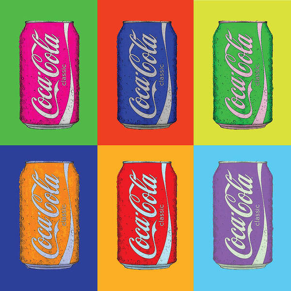
Warhol’s posters extend his Pop Art logic into pure visibility. Borrowing the language of billboards and magazines, he used bold, flat colour and silkscreen repetition to turn faces and objects into brands. A single photographic image of a celebrity, multiplied and recoloured, becomes less a portrait than a logo, an emblem of how fame erases individuality. Even when his posters promote exhibitions or films, they often feel like advertisements for the idea of being seen itself.
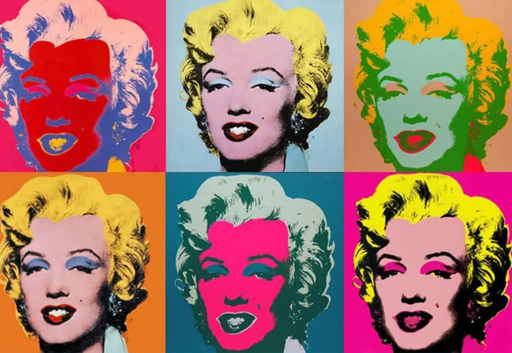
There is an emotional paradox in Warhol’s images. They are immediately seen for what they are, and his posters are magnetic. We recognize Marilyn, a can of soup, or a Coca-Cola bottle in a fraction of a second.
And because these symbols are now so universally famous, owning a Warhol has become the ultimate way for collectors to buy into the very fame he depicted.
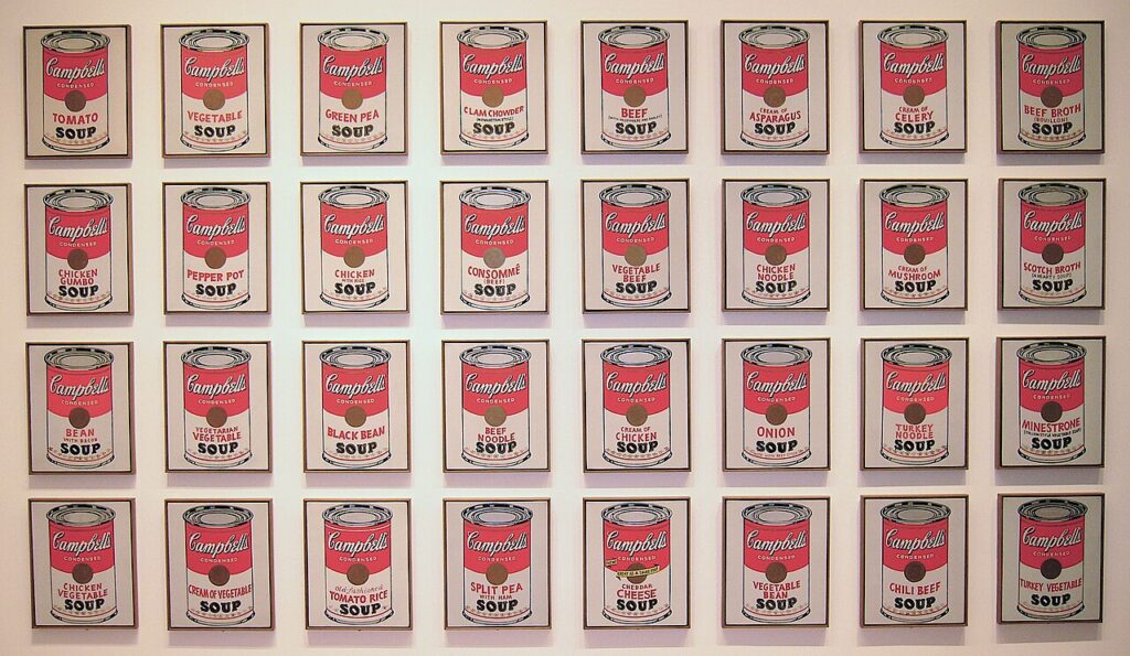
But for some viewers, looking more is finding less. The repetition can drain the subject until all that remains is the rhythm of consumption. His posters are not about who Marilyn was or what soup tastes like; they’re about how we endlessly see, buy, and move on.
The depth of Warhol’s work is found right on the surface, a mirror reflecting Postwar America.
Reindl and the Surreal Truth
Reindl’s posters, created within the Czechoslovak system and later re-evaluated as key works of the communist-era graphic tradition, operate almost in reverse. Where Warhol embraced the slick logic of mass marketing, Reindl worked in a context where importing official Western posters was expensive and restricted, so local artists were asked to invent their own visual worlds.
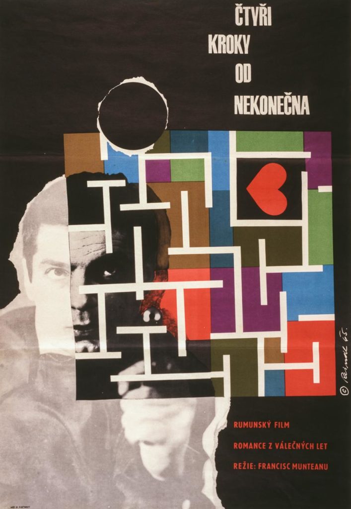
Posters were designed without artists even seeing the film, relying only on the title and a handful of press notes. This forced them to interpret rather than describe. It explains why so many Czechoslovak posters are dreamlike, poetic, and even misleading in relation to the films they promote. In Milos Reindl’s hands, this constraint becomes a strength: the poster is no longer a summary of scenes; it’s a psychological response.
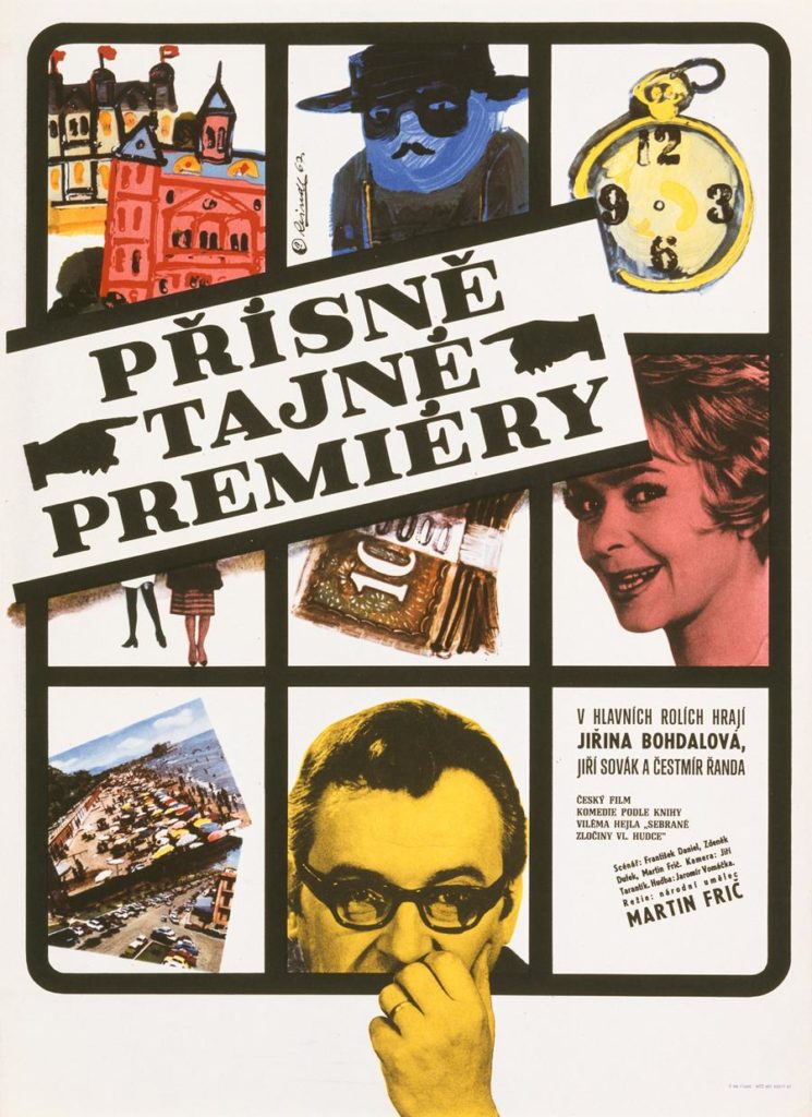
The visual mosaic of Top Secret Premiere, for example, feels like an artist piecing together a story. It forces the viewer to play detective and engage with it intellectually.
Psychological Pop Art
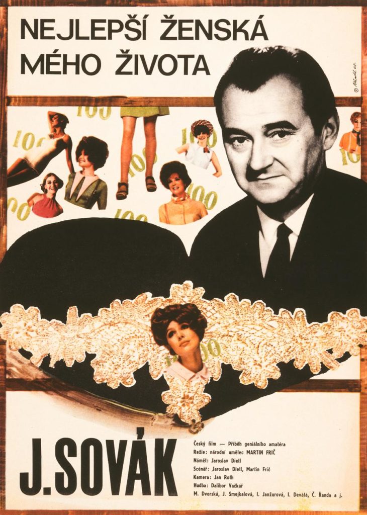
We can find a dialogue with Pop aesthetics in Reindl’s works. In his poster for The Best Woman of My Life, a fragmented collage of female figures mirrors Warhol’s preoccupation with the female image as a recurring motif. However, Reindl uses these cutouts to create an emotional puzzle, surrounding a central, stoic male figure with disparate echoes of femininity.
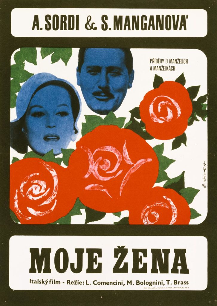
Similarly, the art for My Wife uses a vibrant, monochromatic blue tint on the faces, set against saturated red roses, which evokes Warhol’s bold colour palettes. Yet, Reindl uses this high contrast not to sell an image, but to heighten the uncanny, almost detached mood of the characters.
Freedom in Constraint vs. in Consumption
Warhol’s freedom was that of the market. Using silkscreen and bright inks, he commented on a culture that measures worth in exposure. His posters assume an environment of abundance: abundant products, images, and attention. Here, the anxiety is not about the right to speak, but about being heard in the noise.
Reindl’s freedom was born from constraint. The poster became a safe zone for him. Distilling films into symbolic structures, he revealed a culture trying to feel beneath surveillance. While Warhol mirrors an overexposed world, Reindl reveals a private one.
Two Kinds of Icon
Warhol’s posters have become icons of a specific late-capitalist sensibility: fast, legible, endlessly reproducible. They appeal to collectors who value immediacy and cultural recognizability
Reindl’s posters offer a different proposition. They are not icons of consumption, but of interpretation. Each one is a personal reading of a film filtered through the climate of its time: economic constraints, political tension, and the unexpected freedom that poster design allowed. For a collector, this means owning not just an image, but a compact piece of history. It is a record of how art can slip through cracks in the system and remain deeply human.
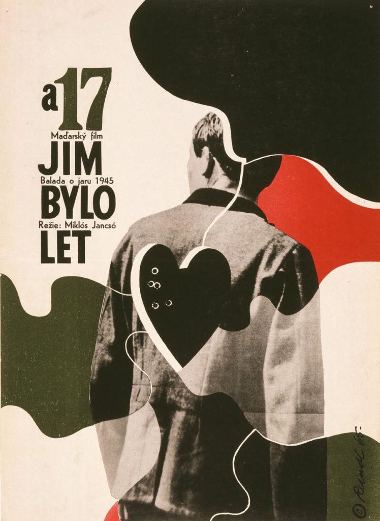
If Warhol teaches us how appearances can shape the cultural landscape, Reindl demonstrates that even on the most public of exteriors, an artist can hide private meanings, melancholies, and acts of quiet resistance. Where Warhol gave us the packaging of emotion, Reindl gives us its echo.